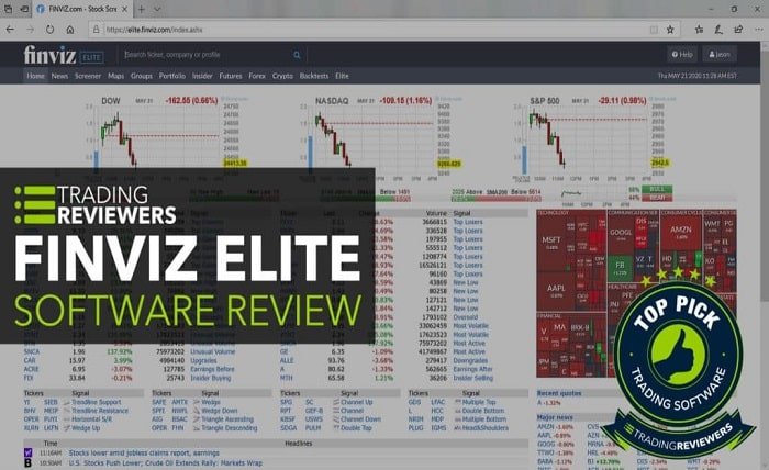
The Finviz Market Map is a widely-used visualization tool that helps investors understand market trends at a glance. It condenses a complex array of stock data into an intuitive, color-coded heat map that offers insights into market performance. Whether you’re a beginner or an experienced trader, the Finviz Market Map provides valuable information for crafting investment strategies. By analyzing this tool, investors can pinpoint opportunities, detect risks, and make data-driven decisions.
What Is the Finviz Market Map?
The Finviz Market Map is an interactive graphical representation of the stock market. It organizes individual stocks into sectors and industries, providing a snapshot of market activity. Stocks are displayed as tiles within a grid, and their sizes are proportional to market capitalization. The colors indicate performance—green for gains, red for losses, and shades to denote the magnitude. By offering an aggregated view of the market, the Finviz Market Map simplifies the complex task of monitoring thousands of stocks simultaneously.
Key Features of the Finviz Market Map
One of the standout features of the Finviz Market Map is its ability to present real-time data visually. Each tile on the map is clickable, providing detailed information about specific stocks. Users can filter the map by sector, industry, or index, allowing for a tailored analysis. Another essential feature is the ability to overlay additional metrics, such as price-to-earnings ratios or dividend yields. These features make the Finviz Market Map an indispensable tool for identifying investment opportunities and market trends.
How to Access and Use the Finviz Market Map
Accessing the Finviz Market Map is straightforward and free on the Finviz website. Advanced users can unlock additional features by subscribing to Finviz Elite. Once on the site, navigating the market map involves selecting specific filters or sorting by sector, performance, or other criteria. Traders often use the Finviz Market Map to quickly assess market sentiment and identify sectors with high volatility or growth potential. By customizing the map settings, users can focus on areas that align with their investment goals.
Benefits of Using the Finviz Market Map
The Finviz Market Map offers several benefits to investors. Firstly, it saves time by consolidating vast amounts of data into a single, easy-to-read graphic. Secondly, its visual format makes it easier to spot trends, such as sector-wide gains or losses. The Finviz Market Map is also highly customizable, allowing users to focus on specific criteria, which helps in making precise investment decisions. Furthermore, its free accessibility ensures that even novice investors can leverage its insights without additional costs.
How the Finviz Market Map Compares to Other Tools
While the Finviz Market Map is highly popular, it’s essential to understand how it stacks up against similar tools. Compared to Bloomberg Terminal or Yahoo Finance, Finviz stands out for its simplicity and affordability. Unlike more complex platforms, the Finviz Market Map caters to visual learners and provides a clear overview without overwhelming users with excessive details. Its unique color-coded design makes it more accessible to traders who value quick, actionable insights over extensive data analysis.
Strategies for Using the Finviz Market Map Effectively
To maximize the benefits of the Finviz Market Map, investors should integrate it into their trading strategies. For example, use the map to identify underperforming sectors during a bearish market and consider diversification. During bullish trends, focus on high-performing sectors highlighted in green. By combining the Finviz Market Map with other tools, such as technical analysis or fundamental research, traders can develop well-rounded strategies tailored to their risk tolerance and investment goals.
Common Pitfalls When Using the Finviz Market Map
While the Finviz Market Map is powerful, relying solely on it can lead to mistakes. One common error is misinterpreting the color-coded data without considering broader economic factors. Another pitfall is overemphasizing short-term trends while ignoring long-term strategies. Investors should use the Finviz Market Map as one of many tools in their toolkit and avoid making decisions based solely on its visual data. Complementary research and analysis are critical for achieving sustainable investment success.
Conclusion
The Finviz Market Map is an invaluable tool for investors looking to make informed decisions in a fast-paced market. By providing a visually compelling representation of stock performance, it simplifies complex data and offers insights into market trends. Whether you’re identifying opportunities or managing risks, the Finviz Market Map can enhance your trading strategy. Incorporate this tool into your investment process, but remember to combine it with other research for a comprehensive approach to investing.
FAQs
1. What is the primary use of the Finviz Market Map?
The Finviz Market Map is primarily used to visualize stock market performance across sectors and industries, helping investors identify trends and opportunities.
2. Is the Finviz Market Map free to use?
Yes, the Finviz Market Map is free to access on the Finviz website. However, advanced features are available with a Finviz Elite subscription.
3. Can beginners use the Finviz Market Map effectively?
Absolutely. The Finviz Market Map is user-friendly and designed to provide valuable insights for both beginners and experienced traders.
4. What do the colors on the Finviz Market Map represent?
The colors indicate stock performance: green for gains, red for losses, and shades to represent the intensity of these movements.
5. How often is the data on the Finviz Market Map updated?
The data on the Finviz Market Map is updated in real-time for Finviz Elite users, while free users experience a slight delay.


